(New page: <br> <center><font size="4"></font> <font size="4">'''Principle Component Analysis (PCA) tutorial''' <br> </font> <font size="2">A [https://www.projectrhea.org/learning/slectures.php sle...) |
|||
| Line 37: | Line 37: | ||
In this section, I will just use PCA on a simple data set to helo you gain some intuition of PCA, the question of "why does it work" is not answered in this section, we just focus on "how to make it work". Then after you get enough intuition from this toy example, you can decide whether PCA will work fine in your application scenario. The mathematical derivation will come later. | In this section, I will just use PCA on a simple data set to helo you gain some intuition of PCA, the question of "why does it work" is not answered in this section, we just focus on "how to make it work". Then after you get enough intuition from this toy example, you can decide whether PCA will work fine in your application scenario. The mathematical derivation will come later. | ||
| − | There are basically 6 steps in the procedure of using PCA, they are 1) Construct the data set, 2) Subtract the mean, 3) Calculate the covariance matrix, 4) Get | + | There are basically 6 steps in the procedure of using PCA, they are 1) Construct the data set, 2) Subtract the mean, 3) Calculate the covariance matrix, 4) Get eigenvalue decomposition of covariance matrix, 5) Choose the significant principle components, 6) Get the transformed data. Now we will go through all of them in detail. |
<font size="2">'''Step1: Construct the data set'''</font> | <font size="2">'''Step1: Construct the data set'''</font> | ||
| − | The data set I choose is only two dimension, because it's easier for visualization. The original data set is shown below in Figure1. This is only a made-up data, there are | + | The data set I choose is only two dimension, because it's easier for visualization. The original data set is shown below in Figure1. This is only a made-up data, there are 19 observations. As we can easily find, there is a positive correlation between the two dimensions. |
| − | [[Image:Original data.jpg|center | + | [[Image:New Original data.jpg|center]]<br> |
| − | Figure 1. Original data set, data dimension is 2, | + | Figure 1. Original data set, data dimension is 2, 19 observations |
| − | '''Step2: | + | <font size="2">'''Step2: Subtract the mean'''</font><br> PCA requires the data set to have zero mean in each of the dimensions so that it can work properly. Thus we have to subtract the mean, which is the sample average, in each dimension. It's not hard to find out that the sample average for the data in dimension 1 is 5.5 and for data in dimension 2 is 5.7283. Then for data in each dimension, we subtract the correponding mean, the result shifted data is shown in Figure 2. |
| − | [[Image:Shifted data.jpg|center | + | [[Image:New Shifted data.jpg|center]]<br> |
Figure 2. Shifted data set, subtract the sample average for each dimension | Figure 2. Shifted data set, subtract the sample average for each dimension | ||
| − | '''Step3: Calculate the covariance matrix''' Since the data is two-dimensional, the covariance matrix should be a symmetric 2x2 matrix. The formula to calculate covariance is <math> \sigma_(x,y) = \ | + | '''Step3: Calculate the covariance matrix''' |
| + | |||
| + | Since the data is two-dimensional, the covariance matrix should be a symmetric 2x2 matrix. The formula to calculate covariance is <math> \sigma_(x,y) = \frac{1}{N-1}\textbf{x}^T \textbf{y} </math>, N is the number of observations, notice that this is an unbiased estimate of the true covariance estimate, the derivation of this formula is beyond the scope of this tutorial. After the easy calculation, we get <math> Cov = \begin{bmatrix} 7.9167 & 8.2813 \\[0.3em] 8.2813 & 9.1552 \end{bmatrix}</math>, notice that the off-diagonal elements are positive, this implies a positive correlation between the data in the two dimensions. They will increase together. | ||
| + | |||
| + | '''Step4: Get eigenvalue decomposition of the covariance matrix''' | ||
| + | |||
| + | Since the covariance matrix is symmetric and square, we can perform the eigenvalue decomposition and get a normalized eigenvector matrix and a diagonal eigenvalue matrix. They are <math> Eigenvector = \begin{bmatrix} -0.7330 & 0.6802 \\[0.3em] 0.6802 & 0.7330 \end{bmatrix} Eigenvalue = \begin{bmatrix} 0.2315 \\[0.3em] 16.8404 \end{bmatrix}</math> Notice that both eigen vectors are unitary vector, i.e. their length is 1. Now we plot the eigenvector together with data set in Figure 3. The red line is the direction for the eigenvector for the smaller eigenvalue, and the blue line is the direction for the eigenvector for the larger eigenvalue. First notice is that the two eigenvectors are perpendicular to each other, as expected. Then, more importantly, the direction of the eignevector shows a siginicant pattern in the data set. It's easy to find out that the blue line goes through all the data points and it is a very good fit to the data. To illustrate the phenomenon better, I also drew the line of best fit using least square regression in magenta. As we can see, the blue line and magenta line are very close to each other. <span class="texhtml">''' '''</span> | ||
| + | |||
| + | <span class="texhtml"</span>[[Image:New_Eigenvector.jpg|center]] | ||
| + | |||
| + | Figure 3. Data set, eigen vector and the best-fit line using least square | ||
| + | |||
| + | |||
---- | ---- | ||
Revision as of 08:37, 23 March 2014
Principle Component Analysis (PCA) tutorial
A slecture by Tian Zhou
(partially based on Prof. Mireille Boutin's ECE 662 lecture)
Contents
What will you learn from this slecture?
- A toy example of using PCA to gain some intuition behind the method
- The mathematical reasoning behind this approach
- The strength and limitation of PCA and potential working field
Prerequisite
This tutorial only requires a working knowledge of baisc linear algebra. If you are familar with standard deviation, covariance and eigen decompostion, then you are fine. If not, Gilbert Strang wrote a great book[1], which is of great help.
Introduction
Principle Component Analysis (PCA) is a statistical method that uses orthonormal transformations to convert the observed correlated data into a set of linearly uncorrelated data, which are the so-called principle components. PCA has found numerous application fields like face recognition, dimension reduction, factor analysis and image compression, etc. Generally speaking, it's a common technique that can find certain patterns in high-dimension data, and thus can reduce the computation efforts by only considering a certain set of significant patterns. When dealing with high-dimension data, it's always not easy for us to visualize the distribution of data, and thus it's very hard to find certain patterns from data which could lead to a better desigh of classifier. PCA could help us in this case, to find the significant patterns.
This tutoril is divided into three sections
- A toy example
- Mathematical derivation
- Discusssion
A toy example
In this section, I will just use PCA on a simple data set to helo you gain some intuition of PCA, the question of "why does it work" is not answered in this section, we just focus on "how to make it work". Then after you get enough intuition from this toy example, you can decide whether PCA will work fine in your application scenario. The mathematical derivation will come later.
There are basically 6 steps in the procedure of using PCA, they are 1) Construct the data set, 2) Subtract the mean, 3) Calculate the covariance matrix, 4) Get eigenvalue decomposition of covariance matrix, 5) Choose the significant principle components, 6) Get the transformed data. Now we will go through all of them in detail.
Step1: Construct the data set
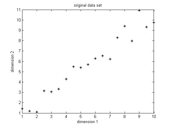
The data set I choose is only two dimension, because it's easier for visualization. The original data set is shown below in Figure1. This is only a made-up data, there are 19 observations. As we can easily find, there is a positive correlation between the two dimensions.
Figure 1. Original data set, data dimension is 2, 19 observations
Step2: Subtract the mean
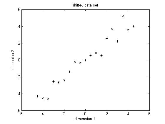
PCA requires the data set to have zero mean in each of the dimensions so that it can work properly. Thus we have to subtract the mean, which is the sample average, in each dimension. It's not hard to find out that the sample average for the data in dimension 1 is 5.5 and for data in dimension 2 is 5.7283. Then for data in each dimension, we subtract the correponding mean, the result shifted data is shown in Figure 2.
Figure 2. Shifted data set, subtract the sample average for each dimension
Step3: Calculate the covariance matrix
Since the data is two-dimensional, the covariance matrix should be a symmetric 2x2 matrix. The formula to calculate covariance is $ \sigma_(x,y) = \frac{1}{N-1}\textbf{x}^T \textbf{y} $, N is the number of observations, notice that this is an unbiased estimate of the true covariance estimate, the derivation of this formula is beyond the scope of this tutorial. After the easy calculation, we get $ Cov = \begin{bmatrix} 7.9167 & 8.2813 \\[0.3em] 8.2813 & 9.1552 \end{bmatrix} $, notice that the off-diagonal elements are positive, this implies a positive correlation between the data in the two dimensions. They will increase together.
Step4: Get eigenvalue decomposition of the covariance matrix
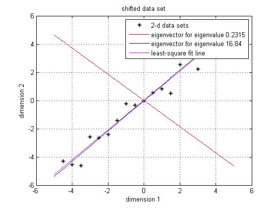
Since the covariance matrix is symmetric and square, we can perform the eigenvalue decomposition and get a normalized eigenvector matrix and a diagonal eigenvalue matrix. They are $ Eigenvector = \begin{bmatrix} -0.7330 & 0.6802 \\[0.3em] 0.6802 & 0.7330 \end{bmatrix} Eigenvalue = \begin{bmatrix} 0.2315 \\[0.3em] 16.8404 \end{bmatrix} $ Notice that both eigen vectors are unitary vector, i.e. their length is 1. Now we plot the eigenvector together with data set in Figure 3. The red line is the direction for the eigenvector for the smaller eigenvalue, and the blue line is the direction for the eigenvector for the larger eigenvalue. First notice is that the two eigenvectors are perpendicular to each other, as expected. Then, more importantly, the direction of the eignevector shows a siginicant pattern in the data set. It's easy to find out that the blue line goes through all the data points and it is a very good fit to the data. To illustrate the phenomenon better, I also drew the line of best fit using least square regression in magenta. As we can see, the blue line and magenta line are very close to each other.
<span class="texhtml"</span>Figure 3. Data set, eigen vector and the best-fit line using least square
References
- Gilbert Strang, "Introduction to Linear Algebra", Wellesley-Cambridge Press, February 2009. ISBN: 9780980232714
- Mireille Boutin, "ECE662: Statistical Pattern Recognition and Decision Making Processes," Purdue University, Spring 2014.
Questions and comments
If you have any questions, comments, etc. please post them on this page.


